How to measure Shopify Product Conversion Rate in GA4
For every Shopify e-commerce manager, understanding how many visitors see a product before one of them decides to purchase is crucial in order to optimize your product performance. Although there are multiple ways to look at conversion rate in Google Analytics 4 (GA4), product page conversion rate doesn’t work in a straightforward, out-of-the-box manner. Fortunately, with a little customization, you can create a product conversion report that provides actionable insights.
What Is Product Conversion Rate?
Product conversion rate tells you how often a product is purchased after being viewed. For example, if a product is viewed 100 times and bought twice, its conversion rate is 2%. While it��’s not perfect (users may buy a different product than the one they viewed), it’s a solid success indicator for individual product pages, especially when comparing multiple products against each other.
Setting Up the Report in GA4
To calculate product conversion rates in GA4, you need to focus on two key events:
- View Item event (item seen by a user, fires on product page)
- Purchase event (product included in a transaction)
These events will allow you to track how often a product is viewed versus being purchased. The purchase event in GA4 contains the items array, which lists the products included in the purchase.
Creating the Exploration Report
Go to Explorations in GA4, start with a blank report, and add the following dimensions and metrics:
Dimension: Item Name
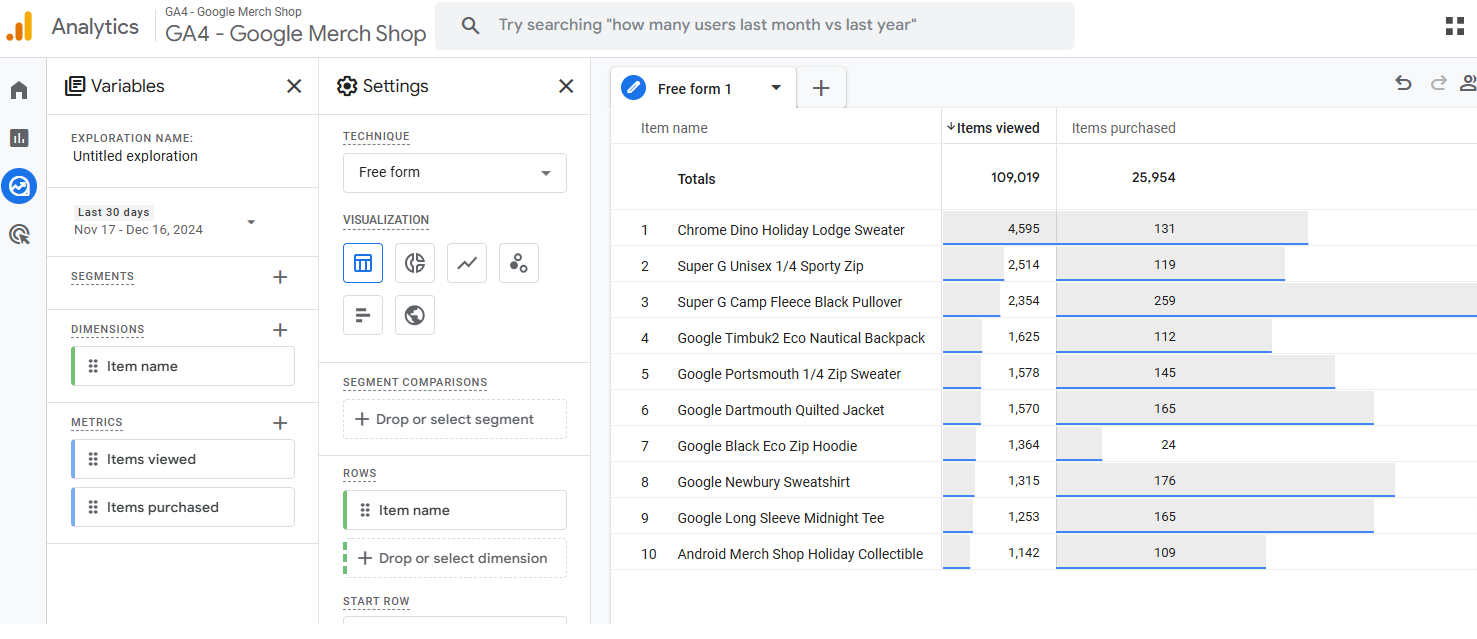
Metrics: Items Viewed (view_item), Items Purchased (purchase)
Combine these into a table like the one below to compare the two metrics against each item name i.e. product.

While an experienced eye can distinguish between better and worse performing products, the volume of events usually confuses novices. Scatter plot to the rescue!
Why Use a Scatter Plot?
To analyze one dimension (Item Name) against two metrics (views and purchases), the scatter plot visualization is a game changer. While often underutilized and even berated by influential bloggers, a scatter plot clearly highlights outliers and trends.
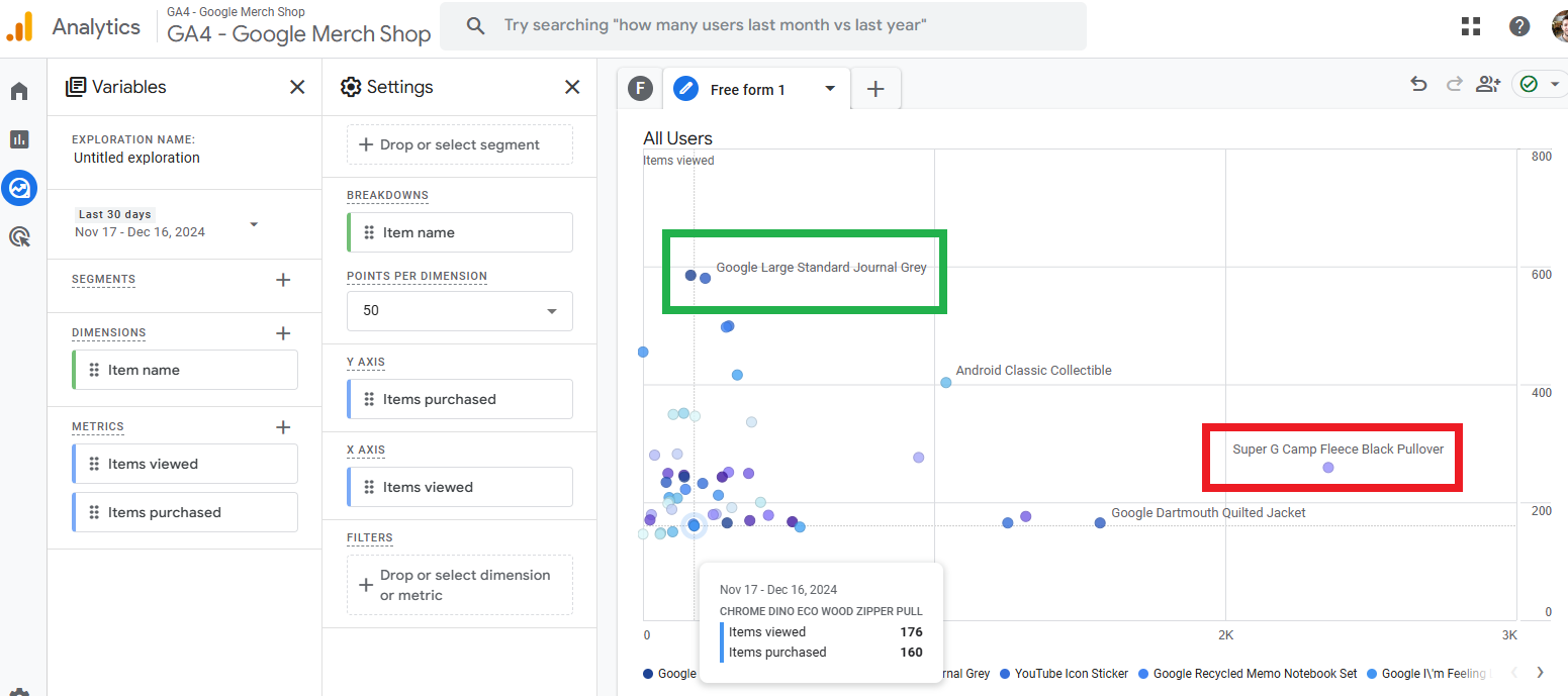
Let's take a look at the same combo of dimensions & metrics from the table above but now in the format of scatter plot:

In this visualization it's easy to identify good performing product (green) that doesn't need to be seen as many times as the red one in order to be purchased.
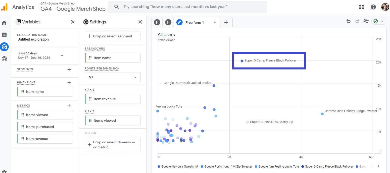
The next graph is about revenue, and not the items sold count, so the Y-axis is gross purchase revenue:

Completely new set of products emerge as winners and losers, each time we change the metrics (the wider the product price range is, the bigger the difference between the "winners/losers").
If a product has far fewer views but a high purchase rate, it indicates strong product appeal. Add revenue as a secondary layer to see which products drive the most value—a $600 product purchased twice outperforms a $10 product purchased a hundred times!
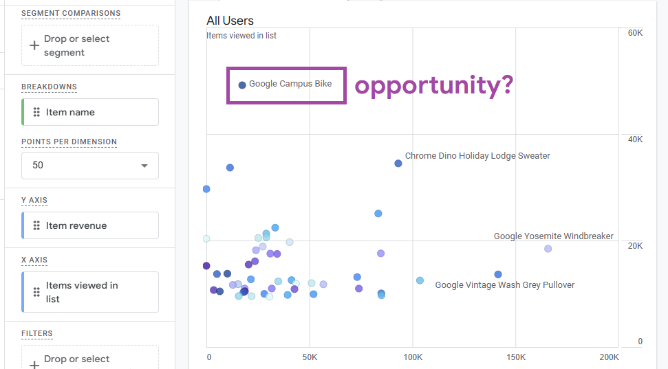
To complete the picture how products perform - it's useful to look at how seeing a product in a list affects the bottom line. So instead on Items viewed, we'll have "Items viewed in list" on the X-axis:

This time the performance insights are slightly different. Does this mean Google should show the bike more often in lists? Probably yes :) No matter your marketing strategy, knowing what happens after a product is seen helps you make more data-driven moves.
Final Product CVR Reporting Tip
To dive deeper, analyze engagement metrics (like bounce rate or average engagement time) alongside conversion rates as well as ecommerce related calculated metrics. This will help you optimize your Product Detail Pages (PDPs) and identify areas for improvement. But while analyzing multiple numbers try avoiding too complex tables - keep the metrics count at 2 and master scatter plot!
By leveraging GA4’s exploration tools and scatter plots, you can effectively measure and improve your Shopify product conversion rates—driving smarter decisions and stronger results for your store.